DESIGN FOR
CONVERSIONS

You are spending money on your marketing. Why aren’t these people converting already?

Conversion focused design is a combination of art and science.

We can help you get the most ROI out of your marketing budget

SIGNUP TODAY TO SUBSCRIBE TO OUR INDUSTRY LEADING BLOG!

YOU HAVE LESS THAN FOUR SECONDS TO PERSUADE ME TO STAY ON YOUR PAGE

How web page design impacts conversions?

You land at various websites every day, whether you arrive at them through links, search engines, or direct access. What makes you delve into one website and spend some time there? What makes you hit the back button before a website even finishes loading?

Let’s face it: in the split second it takes to take a glance at a website for the first time, you don’t have time to be an analyst or a researcher. You’re responding to the site’s layout and visual appeal and maybe, if you’re lucky, a sentence or two or maybe just some keywords.

We’re not trying to paint a negative picture of the human race; we’re just trying to get you some more traffic for your website. 

And as a marketing agency, we have methods.

Testing and Changing Elements of Landing Pages

For instance, testing and changing various elements of your landing pages can dramatically affect the number of conversions your campaign will receive. Take Morningstar, for instance. Morningstar.com changed their banner image from a person to a 3D graphic, inserted two different header texts, and changed the page background to a slightly darker shade of gray. These aren’t major changes and didn’t even involve changes in the substance and content of the pages, but these slight tweaks resulted in a 47% increase in conversions!

In another stunning example, Overstock.com tested and changed their header graphic and received $2 million conversions per month.

Clearly, consistent testing can have a major impact on your conversions, but how do you know what to test? We have learned that the following elements are important to test:

Let’s take a deeper look into these elements.

Visual Contrast

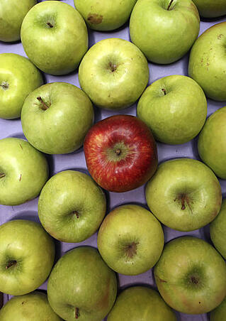
When you change the background color of a page to create contrast, you can “push” the viewer’s eye to where you want it to go. It’s not unlike when a photographer dangles a toy in front of a baby to get him to look at the camera. If you want your viewers to click on a “Contact Us” button, you’ll want to create contrast there. A subtle gray contact button will likely be overlooked, but a bright red mailbox set against a contrasting background is much more likely to get attention.

Beginning and End

If you’re going to include a certain set of content on a landing page, does it really matter what comes first and what comes last? Oh yes.

Looking back, you’re likely to remember your first car and the car you have now, but you won’t remember as much about the cars in between. They’re simply less memorable. Additionally, our brains keep the first and last experience “on” and the rest are “archived” in long-term storage. And it’s the same with content. The first and last items on the page are more memorable than the stuff in the middle. Therefore, the positioning of your content will make a difference in conversions.

We’ve found that the best conversion rates occur when you start your landing page with a call to action about your service or product and then finish with a call to action encouraging your prospect to look at other links on the page, such as promotions, related products, and so forth. This last experience can be helpful with upselling and cross selling or to get feedback from your audience. 

Tangibility

Bring it down to reality. It’s not enough to say that you’ll solve your prospect’s problem. You’ve got to convince him. And the way to do that is to make your solution tangible.

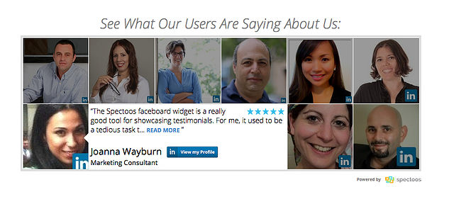
One of the best ways to add tangibility to your site is to include real world online reviews. These are real people talking about how your product or service solved their problems. Think about the reviews you’ve read on Amazon; they’re far more convincing than the product descriptions listed on the same page. We can help you find a way to make your products and services tangible.

Emotional Impact

What are your fears? Loneliness? Poverty? Food stuck in your teeth? Wise marketers fulfill a need or alleviate a fear. Domino’s pizza knows that people are afraid of going hungry, so they promise that they’ll bring piping hot pizza in 30 minutes or less. Volvo knows that people fear car accidents, so they focus their marketing on safety. “Diamonds are forever,” the tagline for De Beers, alleviates fears about separation and the end of marriage. What fear or emotional need can your products or services take care of? Find the answer to this question, and you will convert more prospects.

 30 minutes or less….

Visual Appeal

You’ve got just a few seconds to capture those short attention spans, so your website needs to have tested visual appeal. If viewers need to scroll down to see your best stuff, you’ll lose them. 

Large, easy-to-read banners with important messages can create great contrast between the go-to message and the rest of the page. Eye-catching words like “Free” will grab and hold people’s attention. Calls to action on buttons will get your viewers right to the point–to taking action and moving toward conversion. Strategies like these can improve your visual appeal and convert your prospects.

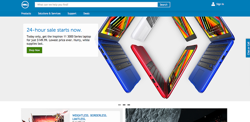
Here, Dell is using colors, tangability, uncomplete images and calls to action in order to get its users to find out more about their current offerings.

Have you wondered how your current business website and landing pages could be redesigned for increased conversions? Here at Park Slope we have studied and tested landing pages and developed methodologies for improving conversion rates on our clients’ sites. You’re in the right place.